Wyvern’s Pricing Index
what is the true rate of inflation?
v1.0
this project is not done; let me open with that
my model still has known flaws. i’ll list the ones i know
but this has been a fascinating project to work on and so i want to share where i am
tl;dr
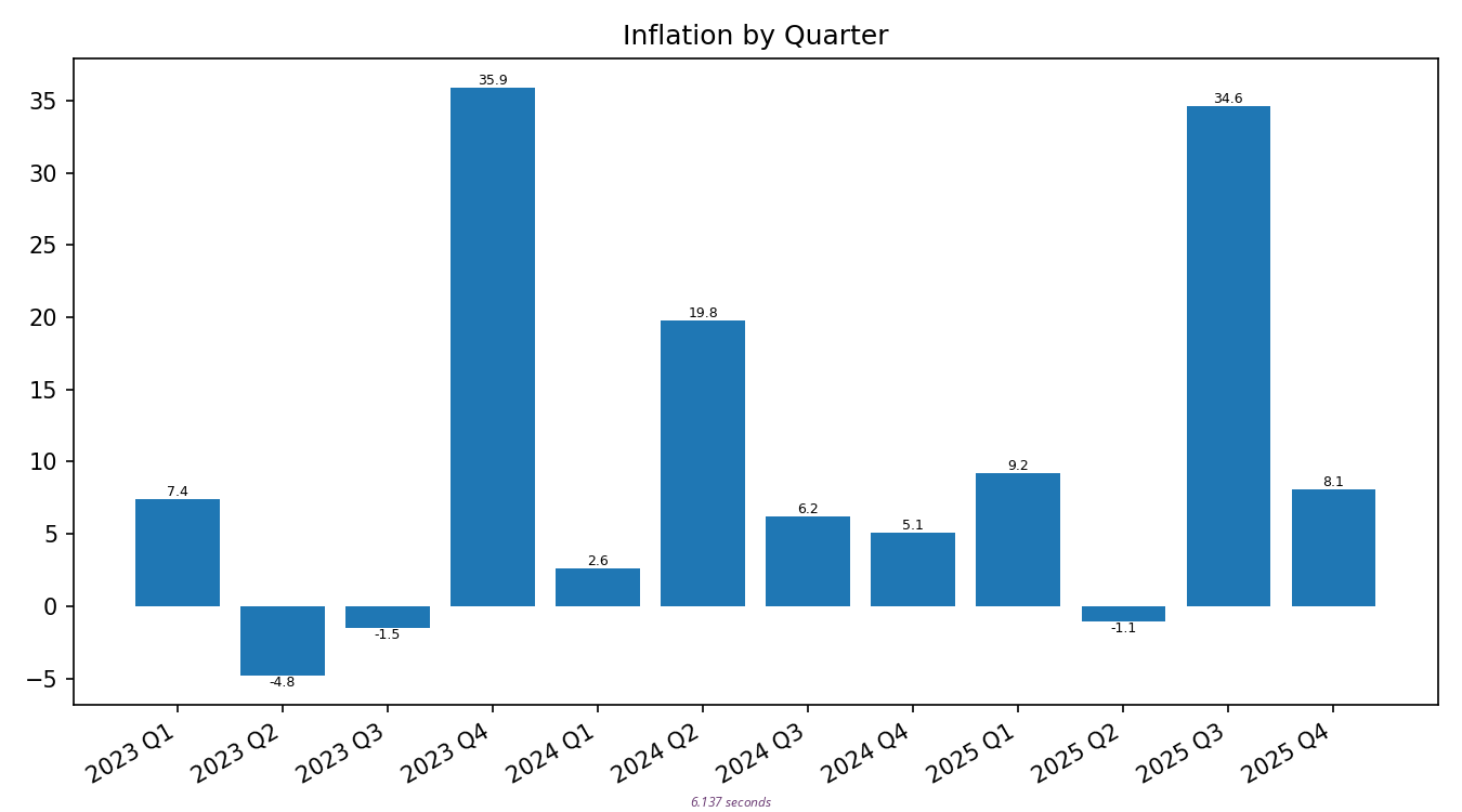
best current estimate:
the rate of inflation i personally see is about 10% when averaged over the last 8 financial quarters
premise
the government lies
the government says inflation is 2.7%
that’s funny
the government inflation rate is called the Consumer Price Index, or CPI. it’s a number generated by the bureau of labor and statistics. it’s supposed to represent how much more expensive everything in our life has gotten recently
the most common variant is the CPI-U, which covers urban consumers, hypothetically about 90% of the US population
the problems with this metric are two-fold:
- what they put in it
- what they leave out
lets do these in opposite order
what they leave out is energy, healthcare, and owned housing
in the case of energy, they leave it out because pricing is supposedly too volatile, and they want a more stable number. thus, they moved energy out of the main CPI stat and into its own category where they don’t have to see it
in the case of healthcare, they include parts, leave out others, and argue it’s based on who pays what bills. but ultimately, healthcare money comes from consumers regardless of how many middle-men are in between, so these arguments make no sense
they won’t consider the cost of a house because they say that’s an investment and not a consumer good
what they include in their calculation are baskets of goods — hypothetical shopping baskets at a hypothetical grocery store. or hypothetical clothing, transportation, recreation, etc
what they don’t tell us is what is inside any particular basket of goods. what we know is they’re allowed to do substations. the classic example is: steak has gotten too expensive? swap it out for ground beef. ground beef is expensive now? try chicken
in theory this makes sense, because consumers do substitutions like this too. in practice, it means quality of life is allowed to slowly erode for the same dollar amount
and that’s the punchline: any time they want, they can make any substitutions they want inside their basket of goods. they don’t have to tell us what they did, and they get to publish a number that makes the sitting president seem glorious
the government has been lying about the rate of inflation for a very long time
how long? nobody really knows
- maybe since 1996 when a special commission started making changes with a published conclusion that the CPI was too high
- maybe since 2022 when all the CPI graphs started smooth descents that they continue to this day
it sure doesn’t feel like inflation has been falling
true inflation
what is the true value of inflation then?
the government’s own metric for inflation including energy is 4.2% right now
wikipedia says that critics who believe as i do — that the gov’t fudges numbers — tend to say the true number for overall US inflation is currently around 7%
me? i have the data, i have the ability, and i’ve always thought it would be a fun project to generate my own CPI value. i think i’ll do just that
why this matters
if our investments can’t beat inflation, they’re losing value
if the government is right and inflation is 3%, then an investment that returns only 5.45% across the last 5 years is still possibly okay
if us pessimists are right, that same investment is arguably troubled
methodology
to make my own inflation rate, i began by categorizing the last several years worth of my and my partner’s expenses
this took a while. truly, i got this idea and started working on it well over a year ago
i’d like to share our full category breakdown, but that feels too privacy-invadey toward my mate. instead i’ll show you the categories it made sense to keep in the price index
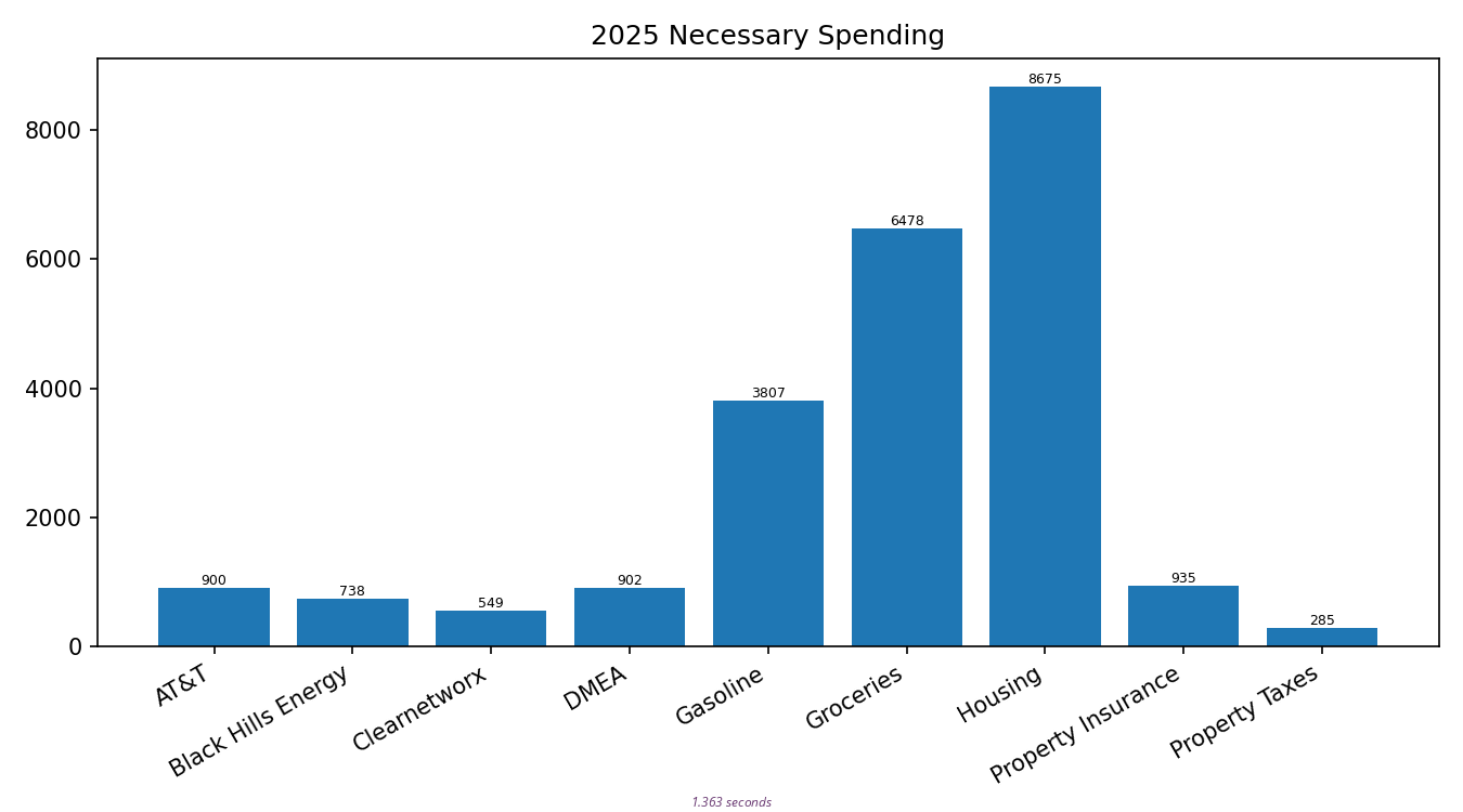
categories
from largest to smallest, the categories in my index are:
- Housing — lot lease, water, and garbage
- Groceries
- Gasoline
- Coffee
- Property Insurance
- DMEA — electricity
- AT&T — cel phone
- Black Hills Energy — natural gas
- Clearnetworx — internet
- Property Taxes
a sampling of some categories that were left out include things like:
- department stores (mostly Walmart)
- online shopping (mostly Amazon)
- vehicle maintenaince
- luxury things; eg: restaurants, liquor, and weed
while it is true that some household needs are met through Walmart and Amazon, in general our spending there is too random to tease the necessary apart from the optional
vehicle maintenance is just too random overall, based on where each of our vehicles is through its own maintenance schedule
and while it is true we spend a depressing amount of money on restaurants, etc., it also seems unfair to include these in my inflation calculation
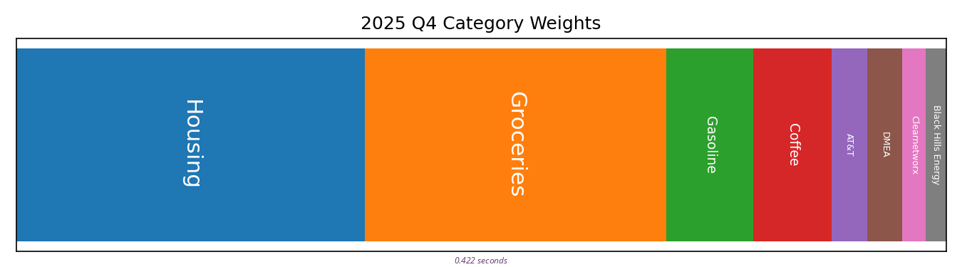
coffee?
the astute reader notes “Coffee” in the last graph, but not the one before
will come back to this, promise
time range & granularity
after categorizing expenses, the next big questions were time range to consider and how finely to slice that range
time start
frustratingly, not all my data starts at the same point in time
AT&T and Black Hills Energy, for example, i have data going back years. Clearnetworx however, we switched to as a provider in 4th quarter 2023. i also don’t have data on my mate’s coffee expenses until similar time period
time end
i did this work in January 2026. no more recent data is included for reasons of respecting causality
granularity
are we considering a yearly inflation rate? or a quarterly inflation rate?
deltas
if we’re calculating a yearly rate, then we just compare any year’s spending against the year before. that’s easy
but if we’re calculating a quarterly rate, do we want to compare a quarter’s spending to the quarter before? or the quarter that’s a year before?
on Coffee and Property Insurance
i’ve run my model yearly and quarterly, and there’s aggregation problems both ways
if i roll data up yearly, then Coffee hasn’t been represented long enough to calculate trusted year-before comparisons
if i roll data up quarterly, then three quarters of the year Property Insurance shows zero expense, which causes other errors
on Black Hills Energy
the reason we might consider comparing not to the quarter before but to the quarter that’s a year before is for cyclic utility usage
for example, consider the following graph:
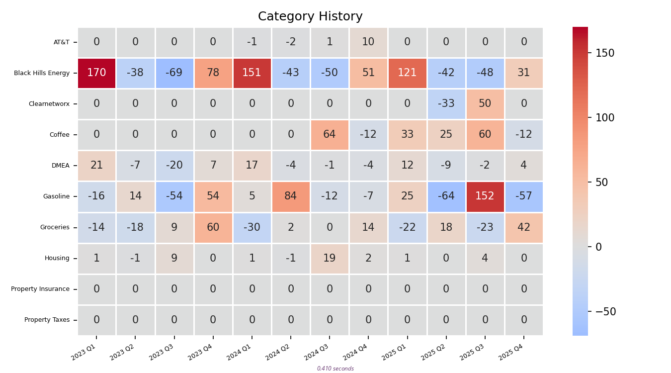
for each financial quarter, this graph shows the category inflation rate since the quarter before
note the cyclic behavior on Black Hills Energy. every winter our gas bill goes up when the furnace runs, and every summer it goes down when the furnace is off
on Groceries and Gasoline
then we have to consider how to aggregate expenses even inside a single time-grain of a single category
for example, any particular transaction of groceries may be higher or lower, depending on our fridge and pantry needs during any particular run. for groceries, a simple sum of all the money spent in any grain of time probably makes sense
conversely, gasoline expenditure depends entirely on how far we each drive
truly, gasoline is the most complex category to consider. would an average expense be a more fair metric than total expense? yes? but even that ignores which vehicle is getting gas. to do it right, i have to split our expenses apart from each other on gasoline
de-tangling gasoline from coffee that happened to be bought at a gas station was a lot of effort already
next steps
let’s consider then how to improve my model
i want quarterly numbers, but this means evolving my code such that different categories can be aggregated in different ways
- i want to choose, per-category:
- delta against most recent quarter or quarter a year prior?
- aggregate by:
- total
- average
- median
- alternately:
- amortize across year
- i’m not properly annualizing my quarterly rates
- per-vehicle gasoline categories
also, once we can do averages instead of totals, would it make sense to include luxury expense categories after all?
- luxury categories?
thanks!
that’s all i got for now
clearly my model is still underbaked, and i do want to keep working on this
but through all the variations i have tested, the intuition i set out to test seems to be confirmed: the inflation i feel here on the ground is a heckuva lot higher than our government says it is
thanks for reading
~wyv