
Wyv’s Pricing Index
summary
we do not believe the government’s published rate of inflation, which is called the Consumer Price Index, or CPI
instead we calculated our own personal rate of inflation, which we’re calling Wyv’s Pricing Index, or WPI
here in western colorady, late summer 2026:
the 1-year trailing average inflation rate is 9.2 %
this means that all our cost of living expenses in the past year have been on average 9.2% higher than the year before
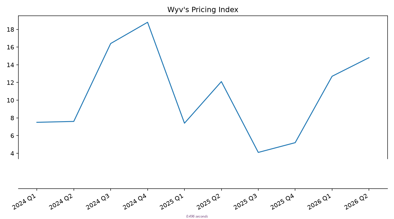
if you’re a little more pessimistic and want the quarterly rate, that’s currently 14.8 %
method
background
followers will remember we did some work on this back in january. we roughed in an estimate of 10% at the time. the work in january concluded though with a discussion of known flaws in our math model
this work today corrects those flaws, as well as includes data up through mid-summer
what data?
the core of this analysis is a categorization of every bank transaction for each of myself and my life partner
most banks, including ours, easily export .CSV files with transaction history. however, banks are not incentivized to help us make sense of our spending patterns. as such, it’s on us to find tools to categorize our own spending history
in our case, i built my own tools, by drawing on my past career as a computer engineer, and a more recent business degree for an understanding of basic accounting
which categories?
after categorizing our spending, the next issue is which categories should be included in our metric
for example: eating at restaurants is a fairly high spending category for us. yet my mate and i are both capable cooks. that makes restaurants a discretionary luxury and not a cost of living expense. it probably should not be included. conversely, groceries probably should be included
after some deliberation, we picked these as our cost of living categories:
- cel phone
- coffee
- electricity
- gasoline
- groceries
- housing
- internet
- natural gas
- property insurance
- property tax
housing includes lot-lease, water, sewer, and garbage
how to aggregate
next we had to decide per each category how to roll up the totals for that category
issues to consider are: granularity, value method, delta method, and horizon
granularity
we would like to calculate a quarterly number for the WPI, but some accounts have a problem with that. specifically, property insurance and property tax are each paid once a year
to make these categories work with quarterly sampling, we have chosen to amortize each annual payment across all four quarters
value method
within any standard category, per quarter, do we want a sum of all transactions? an average? the median transaction?
for most data, the simple sum works well. on some accounts though, most notably gasoline, we’ve found using a median transaction yields less noise
gasoline is a category left out of the government’s CPI entirely because it is too volatile. we can include it here however because we sort transactions by which specific vehicle was being fueled, and can take a median transaction size. while not perfect, this does yield a reasonably strong correlation between our two vehicles, which is enough to trust our values
delta method
given an account value for any quarter, do we difference it against one quarter in the past, or one year in the past?
the intuition of an inflation rate is that it’s a yearly rate, no matter how often we update it. this comes about naturally if we difference each quarter against the quarter a year before
horizon
finally, at what point in time do we believe we have stable data?
in general my mate and i didn’t combine grocery bills until first quarter of 2024. this means that we can’t really start trusting the yearly differences that we calculate until first quarter 2025
for other categories, we don’t have stable data until even somewhat later
at this time though, in all categories, we have at least one year of trustworthy difference data
data
aggregated data
below is all our category change data in one table
historical percent changes
normalized data
if the above table is normalized to quarterly rates, we get this
normalized date ranges
heat map
if we remove the method rows and keep just the data rows, then color red and blue for positive and negative rates, we get this
heat map
weight map
to combine categories together, we need to weight them somehow. here, we’ve calculated weights for each category quarter based on the ratios of total spend across all categories in that quarter
weight map
in other words: columns sum to 100%
combined rate
multiplying the heat map by the weight map yields our quarterly rate for inflation
weighted heat
averages across time
as a chart
here is the same quarterly rate as a line graph
conclusion
our feeling is everything is getting more expensive every year
this i believe has been validated
our own calculated 1-year trailing average inflation rate is currently 9.2 %
our recommendation is that for all financial forecasting, we should use 10 % for the rate of return that we need our investments to beat
